Windows control - Radio button
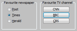
Windows control - Radio button is used to select one of several predefined options. Radio button is not used individually, you can use one radio button for one possible options. Set of radio buttons connected to the same object is understood as a group. The sample below shows two groups - Favourite newspapers and Preferred TV station.
Example
To create radio button
- In the Drawing toolbar click the button Radio button .
- Point the mouse cursor to the position of the first displayer corner and click.
- Point the mouse cursor to the position of the diametric displayer corner and click.
Rules for defining the group of radio buttons
- In the Windows control tab order window, place the radio buttons one after another.
- Check the parameter Group for the first button of the group.
- Check the parameter Group for the first button that follows the last button of the group in the Windows control tab order window.
Warning: In some cases when group of radio buttons is not defined as described above, an infinite loop in Windows systems may occur during evaluation of radio buttons and it may cause blocking the process D2000 HI.
Radio button parameters are being configured in the palette Connect object through the following tabs:
Connect
Connected object
Selection of an object to connect. The object determines which one of the radio button is active and vice versa - the value of the object is being changed when the user select any of the radio buttons. The value of the object is equal to the ordinal number of selected radio button within its group. The object must be of integer type.
In the sample above, there are active the buttons Times and BBC - so the values of connected objects are 2 and 2.
When you connect an object of Structured variable you must define whose item will be connected to the radio button. Unique item position in structured variable is defined by the column name (the parameter Column) and the row number (the parameter Row). For object of Value array you must define which array item will be connected to the radio button.
Script
Reference variable
Specifies the name of the radio button in the form of reference variable for use in the picture script.
Metadata
Assignment of application data (metadata) to a graphic object. If the object contains some metadata, the name of the first record will be displayed in the button. Multiple records are indicated by ",...".
Event
The list box allows user to select a active picture event for the radio button. The list box contains the following active picture events:
Event Handler
The button opens the active picture script to define the active picture event specified by the parameter Event.
Info text/URL
Info text
Text to display as a tooltip when user points the mouse cursor to the radio button in the picture opened in process D2000 HI.
Possibility to use the Dictionary (to open press CTRL+L).
URL
Definition of URL address to open a web page from a picture. The address may be set also in the picture script by the function %HI_SetOBJURL.
Properties
Text
Definition of the string, that will be displayed beside the radio button. Possibility to use the Dictionary (to open press CTRL+L). The string may also display current (so-called live) values of the object defined by the parameter Connected object but such strings must be defined in a special format - for detailed information see the chapter Format masks.
You can also define a hotkey - underlined character. To create an underline character enter the character & (ampersand) before required character. The hotkey (ALT+hotkey) performs the same effect as clicking the button.
Note: Using hotkeys does not work in pictures of MDI type (the parameter Window type - the option MDI window), if this picture is not a subpicture.
Appearance of the checkbox - classic appearance (see the picture in Example above - the checkboxes in the "Favourite newspaper" part) or button appearance (see the picture in Example above - the buttons in the "Favourite TV station" part).
Visible
If the parameter is checked, the radio button will be visible after first opening the picture in process D2000 HI. The parameter can be controlled from the script using the function %HI_SetVisible.
Disabled
If the parameter is checked, the radio button will be disabled after first opening the picture in process D2000 HI. The parameter can be controlled from the picture script using the function %HI_SetEnable.
Group
The parameter allows you to set the radio button as the first control of a group of Windows controls. If the window type of the active picture is set to Dialog (see the topic Picture settings), the user may use the arrow buttons to switch among the radio buttons within one group. You must only define the first control within the group (checking the parameter Group) and the first control out of the group.
For more information on order of Windows controls see the topic Order of Windows controls.
Transparent
Transparent background of the checkbox.
Note: Transparent background is used for displaying on the monitor only (not for print).
Bitmaps
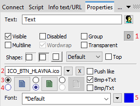
Buttons enable displaying (according to the state they are in) 1-2 bitmaps. When using bitmaps, the parameter transparency is not taken into account, the button is drawn just like using the parameter "How button" but basic (default) position is on the left side and not in the middle.
The window of assigning bitmaps contains selection filed of a bitmap (2) for selected button state.
This field contains the name of a bitmap, the button opening selection window and the button ending the selection (x). Ending the connection is possible also by entering the non-existing name of the bitmap.
Under the selection field, there is a field of bitmaps for possible button states,
where it (3) defines with which state we will work in the selection field (4) and suggests a state type (not selected, selected, disabled). An illustration of individual states:
State selection is for some states (not for prohibited state) possible also by clicking into a display of the used bitmap; and the start of the selection by double-clicking into a display of the used bitmap.
Note relating to D2000 Thin Client
Parameter Bmp is not supported in Thin Client.
For more rules see the page Drawing rules and object properties for D2000 Thin Client.
Font
Clicking the button placed right opens a list of text fonts. A font selected from the list will be used for the radio button text. For more information on text fonts see the topic Text fonts.
Note: Font can be modified (changed) from the picture script using the function %HI_SetFontStyle.
The object order for radio buttons is very important - it defines the values of the radio buttons within one group.


Pridať komentár