"Object properties" palette
There is a defined set of parameters for each graphic object in the process D2000 GrEditor. These parameters are displayed in the palette Object properties. The palette contains some parameters, which are common for several objects (e.g. line color, fill color, line width etc.) and also object dependent parameters (text effect for objects of Text type, 3D for 3D objects, ...).

The palette allows to set parameters of the graphic object in advance of creating the object, or at first to create an object with any parameters and modify them later according to the requirements.
The button  is displayed when user selects more objects. It allows to copy the graphic object properties defined in the Object properties palette to the other objects, which are selected in the object selection. Clicking the button enables to copy the parameters of active graphic object to the other graphic objects in the selection. The parameters are copied only for the graphic objects, which are the same type as the active object. The following parameters are not copied: position, bitmaps and membership in graphic object groups. For graphic object of Multiline and Polygon types, the size of the objects remains unchanged.
The button  causes opening the Connect object palette. This functionality works also vice-versa, i.e. in the Connect object palette opens Object properties palette.
If user does not choose any object, the default parameters of graphic objects can be edited in palette Object properties. Then, the new objects are created according to them. Text in title bar is: "Object properties - Default properties".
This palette also displays the layers.
The palette Object properties, in dependence on the graphic object type, can contains the following tabs.
| Tab | Parameters included in the tab |
| Size | Change size and position of the graphic object. |
| Lines | Set line parameters - line color, style, width, fill color, pattern, line end, line join.... |
| Text | Set text parameters - font, color, text effect, frame, plotting direction.... |
| Bmp | Select or modify a bitmap - color of monochromatic bitmap, dimensions.... |
| Table | Set table parameters - number of rows and lines columns, first row height, first column width, drawing 3D frame. |
| Layout manager | Define a behaviour of individual graphic objects or a selection of graphic objects in the picture when it is resized in process D2000 HI. |
| 3D | Set size and colors of 3D graphic objects. |
Note:
The following descriptions description of the tabs are of Object properties palette is not comprehensive. Depending on the object type, some of the parameters, displayed in the tabs, could be disabled.
Parameters used especially for specific type of graphic object are described in particular topic describing the graphic object in details.
| Kotva | ||||
|---|---|---|---|---|
|
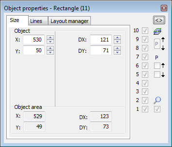
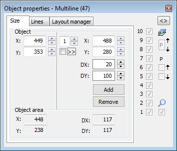
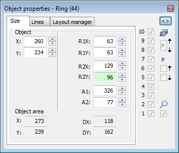
Object
| Kotva | ||||
|---|---|---|---|---|
|
The parameters defines a position of the graphic object in the picture (distance of the object corner left bottom from the picture corner left bottom). They depend on the type of the graphic objects. For example: rectangle - corner left bottom, circle - centre, line - 1st point, polygon - 1st edge, etc.
DX, DY
Size of the graphic object. For example: circle - R1 and R2, ring - R1 and R2, etc. The minimum size is 3 pixels.
Object area
X, Y
Other position parameters
X, Y - Right
The dimensions determine a position of the n-th (entry to the left of X) point of the object in the graphic picture. Positions 1 and above can be changed, and the change is affected by the setting of selection >>. If the option is not set, only the point is moved. If it is set, the following points are also moved by the size of the change of the n point.Size of the minimal rectangle outlining the graphic object.
DX, DY
Size of the graphic object. For example: circle - 1st and 2nd diameters, ring - 1st and 2nd diameter, etc.
Relative
Change of the position from the current position.
Proportional
Both the dimensions keep the aspect ratio.
R1X, R1Y
Circle dimensions. R1X is a horizontal radius and R1Y is a vertical radius.
R2X, R2Y
Dimensions of the 2nd circle for the annulus R2X is a horizontal radius and R2Y is a vertical radius. Rozmery 2.kruhu pre medzikružie.
A1, A2
Starting and ending angle for circular sectors.
Add - V12.1N
Add point for multiple line and polygon..
Remove - V12.1N
Remove point for multiple line and polygon.
Object area
X, Y
Size of the minimal rectangle outlining the graphic object.
DX, DY
Size of the graphic object.
| Kotva | ||||
|---|---|---|---|---|
|

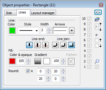
Line
Color
Selection of a line color. Clicking on the color
Line
Selection of a line color. Clicking on the color sample placed below the caption opens the color palette. Clicking on the color in the palette sets it as the color of the line.
Style
Selection of a line style. The list contains the line styles:

Warning:
Drawing and behaviour of dotted lines depends on the operating system. In D2000 systems running under Windows 2000, using a zoom does not change a width of a dash line.
Note relating to D2000 Thin Client
Thin Client supports only solid line.
For more rules see the page Drawing rules and object properties for D2000 Thin Client.
Width
Definition of a line width from 1 to 40.
Arrows
Clicking on the button  shows the items to define arrow shapes of the begin and end points of the graphic object.

Arrow shapes are to be defined in the Beginning and End dropdown boxes:

The spin button Width (1-3) defines an arrow size, where 1 is minimum and 3 is maximum.Kotva
Selection of a graphic object fill. Clicking on the color sample placed below the caption opens the color palette. Clicking on color in the palette sets it as the fill color.
Pattern
Selection of a fill pattern of the graphic object. Clicking on button with corresponding pattern will fill the graphic object with this pattern in the color defined in the parameter Fill.
Line end
Definition of a line end. A type of line end is defined by clicking on corresponding button. The types are shown in the following figure.


Buttons of line end types
View of the line end types
Note relating to D2000 Note relating to D2000 Thin Client
Thin Client supports only full patternthe first type of line end.
For more rules see the page Drawing rules and object properties for D2000 Thin Client.Round
Line join
Setting of a radius level for the corners of the graphic objects (0-99). The value of 0 means, that the corners will not be rounded.
Definition of a line join type.


Note relating to D2000 Thin Client
Thin Client supports only the third type of line join.
Note relating to D2000 Thin Client
Round is not supported in Thin Client.
For more rules see the page Drawing rules and object properties for D2000 Thin Client.
Line end
Definition of a line end. A type of line end is defined by clicking on corresponding button. The types are shown in the following figure.
Buttons of line end types
| Kotva | ||||
|---|---|---|---|---|
|
Color and opaque
Selection of a graphic object fill. Clicking on the color sample placed below the caption opens the color palette. Clicking on color in the palette sets it as the fill color.
Gradient
Defining a gradient fill for flat graphic objects (rectangle, polygon, circle, ...) and 3D graphic objects (multiple 3D line, 3D button, 3D frame, 3D circle button).
Selection of gradient is done by selecting from the window.
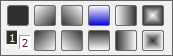
Where 1 and 2 correspond to 1st and 2nd color in black and white version. The top right button is drawing without a gradient, and the other buttons represent a drawing for the gradient. The blue color button corresponds to the status when opening the selection.
First gradient color and coverage
The color copies the setting of the object's fill color. The coverage defines the object's transparency. The parameter ranges from 0-100, where 0 is the zero coverage, object is transparent and 100 is complete coverage - the object is opaque.
Next, there is a setting for the second gradient color and coverage. The second color can be set from the ESL script by the %HI_SetBackColor2 function.
The use of the gradient effect can be enabled-disabled from the ESL script by the %HI_Set_PaintEffects function.
Warning: When using the gradient effect, the width of the graphic object dimensional line remains unchanged even if you use a zoom.
Pattern
Selection of a fill pattern of the graphic object. Clicking on button with corresponding pattern will fill the graphic object with this pattern in the color defined in the parameter Fill. The sample can only be selected if the gradient fill is not used and the object has a 100% coverage.
Note relating to D2000 Thin Client
Thin Client supports only full pattern.
For more rules see the page Drawing rules and object properties for D2000 Thin Client.
Round
Setting of a radius level for the corners of the graphic objects (0-99). The value of 0 means, that the corners will not be rounded. Option 4 allows you to define the rounding of each corner separately.
Note relating to D2000 Thin Client
Round is not supported in Thin Client.
For more rules see the page Drawing rules and object properties for D2000 Thin Client.
| Kotva | ||||
|---|---|---|---|---|
|
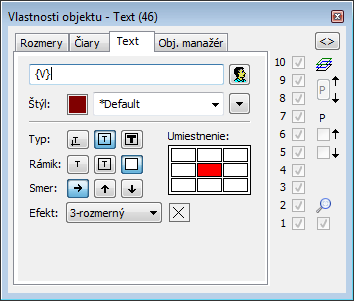
Text
The input edit field contains a text entered during creating the graphic object. It is possible to change it.
Possibility to use the Dictionary (to open press CTRL+L)
View of the line end types
Note relating to D2000 Thin Client
Thin Client supports only the first type of line end.
For more rules see the page Drawing rules and object properties for D2000 Thin Client.
Line join
Definition of a line join type.
Note relating to D2000 Thin Client
Thin Client supports only the third type of line join.
For more rules see the page Drawing rules and object properties for D2000 Thin Client.

Text
The input edit field contains a text entered during creating the graphic object. It is possible to change it.
Possibility to use the Dictionary (to open press CTRL+L).
Note relating to D2000 Thin Client
The input edit field contains a text string corresponding with the selected text object.
For more rules see the page Drawing rules and object properties for D2000 Thin Client.
Color
Selection of a text color. Clicking on the color sample opens the color palette. Clicking on color in the palette sets it as the color for the text.
Font
Clicking on button Font opens the dialog box containing a list of defined text fonts. A font, selected from the list, will be used for the text object. The right side of the dialog box contains a list of defined text fonts and the left side contains the sample of selected font. For more information on text styles see the topic Text fonts.
Type
Definition of a type for placing the text into the picture.


 - nine options.
.
Note relating to D2000 Thin Client
The first two properties work. The third one - The text is placed in a created rectangle to fill the whole area - can not be implemented in the internet browserinput edit field contains a text string corresponding with the selected text object.
For more rules see the page Drawing rules and object properties for D2000 Thin Client.
Frame
For the types (frame) and (fit to window), it is possible to define a method of drawing the rectangle - frame outlining given text.
 | The frame, outlining the text, will not be drawn. |
 | There will be drawn a frame line only. Parameters of the frame line (color, style, width, line join) can be defined in the tab Lines. |
 | There will drawn the frame line and the frame fill. Parameters of the frame line (color, style, width, line join) and frame fill (fill, pattern) can be defined in the tab Lines. |
Direction
Definition of a direction for drawing the text.
Color
Selection of a text color. Clicking on the color sample opens the color palette. Clicking on color in the palette sets it as the color for the text.
Font
Clicking on button Font opens the dialog box containing a list of defined text fonts. A font, selected from the list, will be used for the text object. The right side of the dialog box contains a list of defined text fonts and the left side contains the sample of selected font. For more information on text styles see the topic Text fonts.
Type
Definition of a type for placing the text into the picture.
| The text is placed into the graphic picture on the mouse cursor position. |
| The text is placed in a created rectangle and keeps its proportions according to the definition of the text font. A position of the text in the rectangle is defined using the red square in the rectangle - nine options. |
| The text is placed in a created rectangle to fill the whole area and does not keep its proportions according to the definition of the text font. |


Note relating to D2000 Thin Client
The first two properties work. The third one - The text is placed in a created rectangle to fill the whole area - can not be drawn from the left to right in Thin Clientimplemented in the internet browser.
For more rules see the page Drawing rules and object properties for D2000 Thin Client.
Effect
The drop-down box is placed in the corner right bottom of the tab. Selection of a text effect. The following figures show usage of the effects.
| Normal | Normal - no effect |
 | Back - text with a background |
 | Shade - shade effect |
 | Space - space effect |
 | Space 2 - space effect 2 |
 | 3D - 3D effect |
Frame
For the types (frame) and (fit to window), it is possible to define a method of drawing the rectangle - frame outlining given text.
| The frame, outlining the text, will not be drawn. |
| There will be drawn a frame line only. Parameters of the frame line (color, style, width, line join) can be defined in the tab Lines. |
| There will drawn the frame line and the frame fill. Parameters of the frame line (color, style, width, line join) and frame fill (fill, pattern) can be defined in the tab Lines. |
Direction
Definition of a direction for drawing the text.
| Text is drawn left to right. |
| Text is drawn bottom-up. |
| Text is drawn top-down. |
Note relating to D2000 Thin Client
Thin Client does not support the effectsThe text can be drawn from the left to right in Thin Client.
For more rules see the page Drawing rules and object properties for D2000 Thin Client.
2nd color
Selection of color, that is used for text effects.

Bitmap object
Selection of the object of Bitmap type. Clicking on the button opens a list of bitmaps.
Monochromatic bitmap color
Selection of the color for monochromatic bitmaps.
Note relating to D2000 Thin Client
Thin Client does not support this property.
For more rules see the page Drawing rules and object properties for D2000 Thin Client.
Set original dimensions
Setting of the original dimensions of the bitmap.

Number of rows
The spin box to define a number of rows of the table (1-99).
Number of columns
The spin box to define a number of columns of the table (1-99).
Add
If the option is checked, increasing the number of rows (columns) will not change the size of rows (columns). If the option is not checked, the table keeps its size and increasing the number of rows (columns) will change the size of rows (columns) - reduce in size.
First row height
The spin button to define a height of the first table row (1-99). If the parameter is other than zero, the first row is separated from the others by the double line. If the parameter is zero, the double line is not drawn.
First column width
The spin button to define a width of the first table column (1-99). If the parameter is other than zero, the first column is separated from the others by the double line. If the parameter is zero, the double line is not drawn.
3D frame
Enable / disable drawing the 3D frame outlining the table.
Line
Selection of a line color. Clicking on the color sample opens the color palette. Clicking on the color in palette sets it as the line color.
Pattern
Enable / disable drawing the pattern.
Fill
Selection of color for the fill.
Note relating to D2000 Thin Client
Thin Client does not support this object.
For more rules see the page Drawing rules and object properties for D2000 Thin Client.

3D color
Definition of graphic object colors.


1st color - 5th color item placed before 2nd color item selected in the color palette
2nd color - 5th color item placed after 2nd color item selected in the color palette
Effect
The drop-down box is placed in the corner right bottom of the tab. Selection of a text effect. The following figures show usage of the effects.
| Normal | Normal - no effect |
| Back - text with a background |
| Shade - shade effect |
| Space - space effect |
| Space 2 - space effect 2 |
| 3D - 3D effect |
Note: The effect Background will drawn the rectangle of defined text in color defined in the parameter 2nd color. This color will be also used during displaying the object in D2000 HI - used displayed palette takes no effect on the background defined by this effect.
Note relating to D2000 Thin Client
Thin Client does not support the effects.
For more rules see the page Drawing rules and object properties for D2000 Thin Client.
2nd color
Selection of color, that is used for text effects.
| Kotva | ||||
|---|---|---|---|---|
|
Bitmap object
Selection of the object of Bitmap type. Clicking on the button opens a list of bitmaps.
Monochromatic bitmap color
Selection of the color for monochromatic bitmaps.
Note relating to D2000 Thin Client
Thin Client does not support this property.
For more rules see the page Drawing rules and object properties for D2000 Thin Client.
Set original dimensions
Setting of the original dimensions of the bitmap.
| Kotva | ||||
|---|---|---|---|---|
|
Number of rows
The spin box to define a number of rows of the table (1-99).
Number of columns
The spin box to define a number of columns of the table (1-99).
Add
If the option is checked, increasing the number of rows (columns) will not change the size of rows (columns). If the option is not checked, the table keeps its size and increasing the number of rows (columns) will change the size of rows (columns) - reduce in size.
First row height
The spin button to define a height of the first table row (1-99). If the parameter is other than zero, the first row is separated from the others by the double line. If the parameter is zero, the double line is not drawn.
First column width
The spin button to define a width of the first table column (1-99). If the parameter is other than zero, the first column is separated from the others by the double line. If the parameter is zero, the double line is not drawn.
3D frame
Enable / disable drawing the 3D frame outlining the table.
Line
Selection of a line color. Clicking on the color sample opens the color palette. Clicking on the color in palette sets it as the line color.
Pattern
Enable / disable drawing the pattern.
Fill
Selection of color for the fill.
Note relating to D2000 Thin Client
Thin Client does not support this object.
For more rules see the page Drawing rules and object properties for D2000 Thin Client.
| Kotva | ||||
|---|---|---|---|---|
|
3D color
Definition of graphic object colors.
| |
| Example |
| 1 | 1st color of the graphic object (see the example above). |
| 2 | 2nd color of the graphic object (see the example above). |
| 3 | 3rd color of the graphic object (see the example above). |
| Swap colors | Exchange of 1st color (1) for 3rd color (3). |
| 4 | Selection of 2nd color. The 1st and 3rd colors are to be defined automatically as follows: 1st color - 5th color item placed before 2nd color item selected in the color palette |
| Gray | Automatic setting of 3D colors in grey shades. |
| Expand | It disables 1. and 3. color. These colors are calculated according to 2. color. |
Note relating to D2000 Thin Client
Thin Client supports setting of the color only for 3D button and 3D radio button.
For more rules see the
Note relating to D2000 Thin Client
Thin Client supports setting of the color only for 3D button and 3D radio button.
For more rules see the page Drawing rules and object properties for D2000 Thin Client.
Frame
Setting of the color of graphic object frame (outline).
Fill
Selection of the color of graphic object fill.
Pattern
Selection of a fill pattern of a frame graphic object. Clicking on the pattern - none, full, cross-hatching, ....button with preview of the relevant pattern will fill the rectangle with this pattern, having the color of the Color - Fill option. The pattern can only be selected if the gradient one is not used.
Note relating to D2000 Thin Client
Thin Client does not support pattern.
For more rules see the page Drawing rules and object properties for D2000 Thin Client.
Size
Height
The spin button to define a height of the graphic object (1-99). (2 in the example bellow)
Width
The spin button to define a width of the graphic object (1-99). (1 in the example bellow)
3D
The spin button to define a down-grade of the graphic object (1-99). (3 in the example bellow)

| 1 | 3D object width |
| 2 | 3D object height |
| 3 | 3D object down-grade |
| 4 | 3D object fill |
| 5 | 3D object |
Note relating to D2000 Thin Client
Thin Client supports only setting of height of 3D button and 3D radio button.
For more rules see the page Drawing rules and object properties for D2000 Thin Client.
| Kotva | ||||
|---|---|---|---|---|
|

Ratio
When an object changes its size, it keeps an initial aspect ratio (width-to-height). A calculation takes the ratio of the displayed picture to the original picture according to the least maximization (or the highest minimization) in one of the picture sizes.
Action after changed picture width
No action
The graphic object keeps its width - no change.
Ratio change
The graphic object changes its width and position according to the displayed picture-to-original picture ratio. (Picture Settings - Size - Width).
Ratio position *
The graphic object changes its position (tab Size - parameters X, Y) according to the displayed picture-to-original picture ratio.
Keep at right margin
The graphic object keeps the distance from the right picture margin during changing the picture width.
Change width *
The graphic object changes its width according to changing the picture width. If a new width is negative number, the graphic object will be invisible.
Ratio position (center)
The graphic object changes its position (tab Size - parameters X, Y). New position is calculated so that the position of the object centre is changed according to the displayed picture-to-original picture ratio.
Action after changed picture height
No action
The graphic object keeps its height - no change.
Ratio change
The graphic object changes its height and position according to the displayed picture-to-original picture ratio. (Picture Settings - Size - Height).
Ratio position *
The graphic object changes its position (tab Size - parameters X, Y) according to the displayed picture-to-original picture ratio.
Keep at bottom margin
The graphic object keeps the distance from the right picture margin during changing the picture height.
Change height *
The graphic object changes its width according to changing the picture width. If a new width is a negative number, the graphic object will be invisible.
Ratio position (center)
The graphic object changes its position (tab Size - parameters X, Y). New position is calculated so that the position of the object centre is changed according to the displayed picture-to-original picture ratio.
Zoom
If marked, it enables to use the transformation functions from Windows. If not, the size parameters are calculated by HI process.
* The parameters are ignored for the graphic object of the types Polyline, Dashed polyline and Rectangle.
Note 1: The tab is available in case that the parameter Resize with layout manager is checked in dialog window Picture settings.
Note 2: Behaviour of an graphic object of Text type depends on its configuration. Example: size of such a graphic object is changed only if the button (in all rectangle) is pressed.
Note relating to D2000 Thin Client
Layout manager does not work for each object. It works for the graphic objects Rectangle, 3D button, Bitmap, displayers Browser, Graph, Picture, widows controls Tab control, Push button, List box, Check button, Radio button, Tree view, Text (only the area in which is the text), Text entry field in D2000 Thin Client.
For more rules see the page Drawing rules and object properties for D2000 Thin Client.

Color
Selection of 2nd gradient color. Clicking on the color sample placed below the caption opens the color palette. Clicking on the color in the palette sets it as the 2nd gradient color of the graphic object.
As the 1st gradient color, there is used the fill color - defined in the tab Lines, parameter Fill.You can set this color also from ESL script by the function %HI_SetBackColor2.
the position of the object centre is changed according to the displayed picture-to-original picture ratio.
Zoom
If marked, it enables to use the transformation functions from Windows. If not, the size parameters are calculated by HI process.
* The parameters are ignored for the graphic object of the types Polyline, Dashed polyline and Rectangle.
Note 1: The tab is available in case that the parameter Resize with layout manager is checked in dialog window Picture settings.
Note 2: Behaviour of an graphic object of Text type depends on its configuration. Example: size of such a graphic object is changed only if the button (in all rectangle) is pressed.
Note relating to D2000 Thin Client
Layout manager does not work for each object. It works for the graphic objects Rectangle, 3D button, Bitmap, displayers Browser, Graph, Picture, widows controls Tab control, Push button, List box, Check button, Radio button, Tree view, Text (only the area in which is the text), Text entry field in D2000 Thin Client
Type
Selection of gradient effect type.
ON
Allows to use gradient effect defined through the tab. It can be set also in ESL script by the function %HI_Set_PaintEffects.
Inv.
Inverse gradient effect.
Transp.1
Transparency of 1st gradient (fill) color (0-100).
Transp.2
Transparency of 2nd gradient color (0-100).
Warning: When using the gradient effect, the width of the graphic object dimensional line remains unchanged even if you use a zoom.
Note relating to D2000 Thin Client
Thin Client does not support the effects.
For more rules see the page Drawing rules and object properties for D2000 Thin Client.
| Info | ||
|---|---|---|
| ||