Windows control - List box
Windows control - List the list box is used to display a set of text information. User Users can select one particular data from the displayed set. There are supported three basic types of list boxes - standard list box (right one in the sample below), drop-down list box (left one) and editable list box.
The list may be filled from a script or defined by a contents content according to a status text, which is connected to the object.
These conditions are applied for the second option:
- The connected object must be of Integer type.
- The value of the status text in the object must be of REAL or INTEGER type. A usage must be defined for the values, a base value must be integer and a stem must be 1.
...
- The empty string, defined for some of the values in the status text, cannot be inserted to into the List box.
- The function %HI_GetSelectedItem returns an index (from 1 ...) of the current (selected) row in the list box. The index need not correspond with the consecutive number of status text (the order corresponds providing that the extended status text is not used - it increases the number by 1 and the status text does not contains any empty items).
List The list box may be conditioned that it must be filled in HI. If any item is not selected, or the editable list box is empty, the background of the list box matches with the color defined in the application parameters. In the D2000 GrEditor, the entry field is always colored according to this parameter. DropThe drop-down list in a rolled-up state has an appearance that corresponds with Windows appearance.
...
- Optional item - no change of color (default),
- Conditioned mandatory item – color set according to application parameters ColorConditionalItems
- Mandatory item – color set according to application parameters ColorMandatoryItems
Example

To create a list box
- In the Drawing toolbar click the button List box
 .
. - Point the mouse cursor to the position of the first displayer corner and click.
- Point the mouse cursor to the position of the diametric displayer corner and click.
...
Selection of an object to connect. The object allows to set the number of selected list box line and vice versa - the value of the connected object is being changed when the user select any of the list box lines. Lines are numbered from above and numbering begins from 1. The object must be of integer type.
When you connect an object of Structured variable you must define whose item will be connected to the list box. Unique item position in a structured variable is defined by the column name (the parameter Column) and the row number (the parameter Row). For the object of Value array, you must define which array item will be connected to the list box.
...
Note relating to D2000 Thin Client
Parameter The parameter is not implemented in Thin Client.
For more rules see the page Drawing rules and object properties for the D2000 Thin Client.
Script
...
Reference variable
Specifies the name of the list box in the form of a reference variable for use in the picture script.
...
Assignment of application data (metadata) to a graphic object. If the object contains some metadata, the name of the first record will be displayed in the button. Multiple records are indicated by ",...".
Event
The list box allows the user to select an active picture event for the list box. The list contains the following active picture events:
...
Text to display as a tooltip when user points the mouse cursor to the list box in the picture opened in process the D2000 HI process.
Possibility to use the Dictionary (to open press CTRL+L).
...
Definition of URL address to open a web page from a picture. The address may also be set also in the picture script by the function %HI_SetOBJURL.
| Kotva | ||||
|---|---|---|---|---|
|
...
Text The text entry field may be conditioned that it must be filled in HI. If any text is not entered, the background of the field matches with the color defined in the application parameters. In the D2000 GrEditor, the entry field is always colored according to this parameter.
Conditions for using background:
 Optional item - used backgroud background color,
 Conditioned mandatory item – color set according to application parameters ColorConditionalItems
 Mandatory item – color set according to application parameters ColorMandatoryItems
...
If the parameter is checked, the list box will be visible after first opening the picture in process the D2000 HI process. The parameter can be controlled from the script using the function %HI_SetVisible.
...
| Kotva | ||||
|---|---|---|---|---|
|
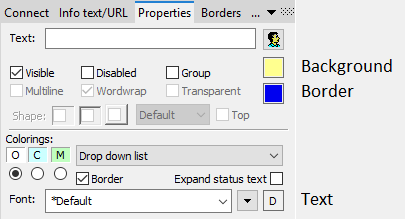
The parameter Type allows us to define the type of the list box. There are three values: List, Drop down list and Drop down combo.
List Thelist defines a standard list box (displayed in the right part of the sample above). Drop-down list defines a list that displays just a currently selected line and it is opened after clicking the button. Drop-down combo is a modification of drop-down list and allows you to enter a text.
Note relating to D2000 Thin Client
List type - Drop-down combo is not implemented in Thin Client.
For more rules see the page Drawing rules and object properties for the D2000 Thin Client.
Expand status text
...
- No searching - keeps the previous behaviour of windows control.
- Searching - enables a dynamic searching search that causes a selection of itemitems, which is the most identical to a searched expression.
- Searching with restriction - the same as the Searching option and it also temporarily removes the items that do not match the searched expression.
In the following table, there is shown a support for the dynamic searching in the different types of list boxboxes:
| Searching | Restriction | |
|---|---|---|
| List | implicitly | NO |
| Drop-down list | YES | YES |
| Drop-down combo | implicitly | YES |
...
The use of searching with restriction in the drop-down list: According to the entered string, the contents of the list are restricted to the identical items. If some of the items is are selected, or the list is closed, the content reverts to its initial state.
| Info | ||
|---|---|---|
| ||
Windows controls |
...