...
Windows control - Push button is used to generate a picture event after pressing the button. The event can be handled in the picture script.
Example

To create a push button
- In the Drawing toolbar click the button Push button
 .
. - Point the mouse cursor to the position of the first displayer corner and click.
- Point the mouse cursor to the position of the diametric displayer corner and click.
...
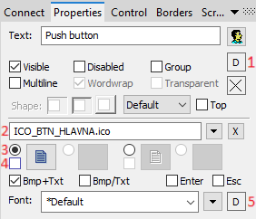
The Windows control has no value and therefore the parameters on this tab are meaningful only for the description of the Windows control (see the parameter Text)
Connected object
Selection of an object to connect.
When you connect an object of the Structured variable you must define an item. Unique item position in the structured variable is defined by the column name (parameter Column) and the row number (parameter Row). For an object of the Value array you must define an item.
Control
...
The palette for button, as one of the only Windows controls contains element, has the tab Control . The tab allows to define an object, that will be directly controlled with no need to define the action in the picture script. Description tab enabled and enables direct control of objects after pressing the button without the need for the definition of a picture script. A more detailed description of the tab is given in the topic Connecting graphic object to control.
| Kotva | ||||
|---|---|---|---|---|
|
...
Reference variable
Specifies the name of the push button in the form of a reference variable for use in the picture script.
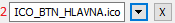
Metadata
Assignment of application data (metadata) to a graphic object. If the object contains some metadata, the name of the first record will be displayed in on the button. Multiple records are indicated by ",...".
Event
The list box allows a user to select a an active picture event for the push button. The list box contains the following active picture events:
Note relating to the D2000 Thin Client
Event The event handler of OnUserInput is not implemented in Thin Client.
For more rules see the page Drawing rules and object properties for the D2000 Thin Client.
Event Handler
The button opens the active picture script to define the active picture event specified by the parameter Event.
Info text/URL
...
Info text
Text to display as a tooltip when the user points the mouse cursor to the button in the picture opened in process the D2000 HI process.
Possibility to use the Dictionary (to open press CTRL+L).
URL
Definition of URL address to open a web page from a picture. The address may be set also in the picture script by the function %HI_SetOBJURL.
| Kotva | ||||
|---|---|---|---|---|
|
...
| Kotva | ||||
|---|---|---|---|---|
|
A string , that will be displayed on the push button. The string may also display current (so-called live) values of the object defined by the parameter Connected object but such strings must be defined in a special format - for detailed information see the chapter Format masks.
Possibility to use the Dictionary (to open press CTRL+L).
You can also define a hotkey for the button-underlined character. To create an underline character enter the character & (ampersand) before the required character.
The button displayed above contains the underlined character O, so the hotkey is ALT+O. The hotkey performs the same effect as clicking the button.
Note: Using hotkeys doesn't work in pictures of MDI type (the parameter Window type - the option MDI window), if such a picture is not a subpicture.
Visible
If the parameter is checked, the push button will be visible after first opening the picture in process the D2000 HI process. The parameter can be controlled from the script using the function %HI_SetVisible.
Disabled
If the parameter is checked, the push button will be disabled after first opening the picture in process the D2000 HI process. The parameter can be controlled from the picture script using the function %HI_SetEnable.
Group
The parameter allows you to set the push button as the first control of a group of Windows controls.
Enter
Definition button for Enter.
Esc
Definition button for Esc.
Support for the Enter and Esc keys works under the following conditions:
- It works for dialog pictures and the subpictures of dialog-modal windows only.
- The button "OK" is to be created as the first picture element (ID = GO number = 1) - can be invisible. The button gets a message from the Enter key as defined for dialog windows in the Windows operating systemssystem.
- The button "CANCEL" is to be created as the second picture element "CANCEL" (ID = GO number = 2) - can be invisible. The button gets a message from the Esc key.
- Pressing the Enter and Esc keys for the buttons defined in this way is concerning the main picture defined as a dialog one or a subpicture of a dialog-modal picture.
Note relating to D2000 Thin Client
This parameter is not supported in the Thin Client.
For more rules see the page Drawing rules and object properties for the D2000 Thin Client.
Bmp
Clicking the button placed right opens a list of bitmaps. Selected bitmap will be displayed on the button in process D2000 HI (if the parameter Text is defined, the string defined in it will not be visible on the button).
Note relating to D2000 Thin Client
It is not possible to align bitmap in button vertically in Thin Client.
For more rules see the page Drawing rules and object properties for D2000 Thin Client.
Bmp2
Clicking the button placed right opens a list of bitmaps. Selected bitmap will be displayed on the button in process D2000 HI if the button is disabled (the parameter Disabled checked).
Bitmaps
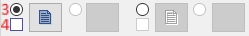
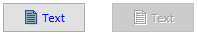
Buttons enable displaying (according to the state they are in) 1-2 bitmaps. When using bitmaps, the parameter transparency is not taken into account, the button is drawn just like using the parameter "How button" but the basic (default) position is on the left side and not in the middle.
The window for assigning bitmaps contains a selection filed of a bitmap (2) for the selected button state.
This field contains the name of a bitmap, the button opening the selection window and the button ending the selection (x). Ending the connection is possible also by entering the non-existing name of the bitmap.
Under the selection field, there is a field of bitmaps for possible button states,
where it (3) defines with which state (allowed or prohibited) we will work in the selection field. (4) and suggests a state type (normal, disabled). An illustration of individual states:
State selection is for some states (not for prohibited states) possible also by clicking into a display of the used bitmap, and the start of the selection by double-clicking into a display of the used bitmap.
Note: When using a colour bitmap, the Windows system Note: In use of a color bitmap, Windows systems converts it to a monochromatic one, and therefore we recommend you to use using monochromatic bitmaps to avoid distortion of color the colour bitmap.
Note relating to D2000 Thin Client
It is not possible to align the bitmap in the button vertically in the Thin Client.
The thin client does not support a bitmap for the disabled state is not Parameter Bmp2 is not supported in Thin Client.
For more rules see the page Drawing rules and object properties for D2000 Thin Client.
Font
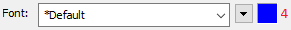
The name of the used font is displayed in the unpacking list that contains the last used fonts for speeding up the selection. Clicking the button placed right opens a list of text fonts. A font selected from the list will be used for the button text. For more information on the text, fonts see the topic Text fonts.
The last parameter is colour text (5) and its selection. If there is a letter D in the field, the default colour from Windows will be used.
Note: Font can be modified (changed) from the picture script using the function %HI_SetFontStyle.
...