...
The parameters of Browser displayer can be configured in the palette Connect object through the following tabs:
Connect
...
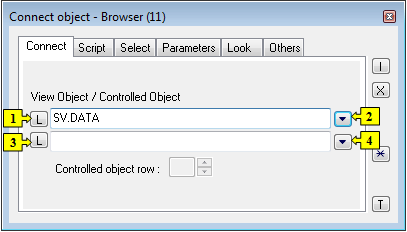
| 1 | Selection of an object of Structured variable or Database table types, which will be displayed in the Browser. |
| 2 | Selection of a local variable, which will be displayed in the Browser. |
| 3 | Selection of a structure to control. |
| 4 | Selection of a local variable to control. |
View object
Choice of a structure (local variable, structured variable or table), that is to be displayed by the Browser.
...
Set of parameters depends on the type of connected object. For objects of Database table type all the parameters displayed in the figure above are enabled , for objects of Structured variable type, only the parameters Edit and Column descriptions are enabled.
| Parameter | Meaning | ||||||
|---|---|---|---|---|---|---|---|
| Paging | Enables / disables paging controls. | ||||||
| Number of lines in displayed page. Empty value or value 0 means dynamic number of lines depending on the browser's height. For objects of Database table type, the maximum number of lines is limited by a Database configuration parameter Maximum returned rows. Note: For objects of Database table type. Even if a dynamic number of lines is configured (empty value or value 0), after the change of browser's height the browser doesn't automatically refresh its content with changed number of lines. Moreover, moving between the pages also uses the original page size. To use a new page size it is necessary to call the function %HI_RefreshData. | ||||||
| Edit | Enables / disables editing of the displayed object (view object). | ||||||
| Insert | Enables / disables inserting new lines. | ||||||
| Delete | Enables / disables deleting the liines. | ||||||
| Column descriptions | Shows / hides the column captions. Descriptions are defined by the configuration of the object of Structure definition type in the process D2000 CNF - the item Description for given column). If the parameter is not checked, there will be displayed column names. | ||||||
| Condition change | Enables / disables changing the selection and sorting conditions. | ||||||
| Show grid | Shows / hides the grid. | ||||||
| Show selection | Shows / hides highlighting the active (selected) row. | ||||||
| Horizontal borders | Shows/ hides the horizontal row dividing lines. | ||||||
| Vertical borders | Shows / hides the vertical row dividing lines. | ||||||
| Show line numbers | Shows / hides the numbers of lines - first row. | ||||||
| Splitter | The parameter allows to split the Browser into independent sections using the horizontal or vertical splitters. | ||||||
| Show column headers | Shows / hides the row containing the column captions. | ||||||
| Transparent selection | Shows / hides transparent highlighting the active (selected) row (it allows to show the row background color). | ||||||
| Multiselect | Allows to select multiple lines. | ||||||
| Automatic refresh | Sets the automatic refresh in Browser displayer, if the object Table is connected to it. |
Note relating to D2000 Thin Client
...
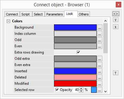
The tab Look allows to define an appearance of the Browser.
Colors:
| Parameter | Meaning |
|---|---|
| Background | Background color |
| Index column |
| Background color of the |
| index column. |
| Odd |
| Background color of odd lines. | |
| Even | Background color of even lines. |
| Extra rows drawing | Draw extra rows below the data rows |
| Odd extra | Background color of extra |
| odd lines. |
| Even extra |
| Background color of extra even lines. |
| Inserted |
| Background color of inserted values. |
| Deleted |
| Background color of deleted values. |
| Modified |
| Text color of modified values. | |
| Selected | Current row will be highlighted. |
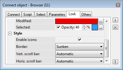
Style:
| Parameter | Meaning |
|---|---|
| Enable icons | If the option is checked off, the icons may be set to the cells of browser by the function %HI_SetBrowserItemImage. |
| Border | Border type (None, Thin, Sunken, Raised). |
| Horiz. scroll bar | Displaying the horizontal scroll bar (Never, Automatic, Always). |
| Vertic. scroll bar | Displaying the vertical scroll bar (Never, Automatic, Always). |
| Paging bar | Enables/disables a paging bar below browser (Never, Automatic, Always). |
| Paging buttons | Enables/disables buttons on paging bar below browser (Never, Automatic). |
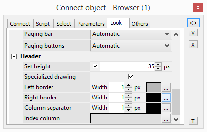
Header:
| Parameter | Meaning |
|---|---|
| Set height | If the option is checked, it is possible to specify the height of the header. |
| Specialized drawing | If the option is checked, it is possible to specify the colors and borders used to draw the header. |
| Left border | Adjusting the width and color of the column heading border. |
| Right border | Adjusting the width and color of the column heading border. |
| Column separator | Adjusting the width and color of the column separator. |
| Index column | Background color of the header index column |
Others
...
The tab Others contains other, not often used parameters.
...
| Kotva | ||||
|---|---|---|---|---|
|
| Column | Meaning | ||||||
|---|---|---|---|---|---|---|---|
| Visible order | The order of structure columns for displaying in Browser window. | ||||||
| Order in the structure | The order of columns in the structure definition (the user cannot change it). | ||||||
| Name | Name in the structure definition. | ||||||
| Caption | Column name to be displayed in the Browser window. | ||||||
| Visible | Shows / hides the column in the Browser window. | ||||||
| Editable | Enables / disables editing values of the column. | ||||||
| Width | Column width. It may contain arbitrary values. The values of 0 and -1 set the column width as follows:
| ||||||
| Align | Text alignment in the columns. | ||||||
| Defines the type to display the items in given column:
| ||||||
| Displ. palette | Selection of a display palette (double-clicking the item opens the list of display palettes). If mark * is marked in cell, setting from status text of correspondent column is used for colour setting of the cell. It's possible to enter number of column to the cell (according to the order in structure), from which the display palette is inherited to actual column | ||||||
| Trans. palette | Selection of a transformation palette (clicking the item opens the dropdown box containing defined transformation palettes) | ||||||
| Use status text | Sets the editing method of cells. If ticked off, the cells of the given column can be edited by using a list box that contains the status texts defined for the column. If not ticked, you may write a value directly to the text field. | ||||||
| Header background color | Sets the color of header background (requires enabled "Specialized drawing" option) | ||||||
| Header text color | Sets the color of text in header (requires enabled "Specialized drawing" option) | ||||||
| Header font | Sets the font of header (requires enabled "Specialized drawing" option) | ||||||
| Header align | Sets the alignment of text in header (requires enabled "Specialized drawing" option) | ||||||
| Metadata | Allows to configure metadata in the dialog box. If the column contains some metadata, the name of the first record will be displayed in the table. Multiple records are indicated by ",...". |
The buttons , , and allow changing the order of columns in the browser window.
...


